Evening all!

Welcome to tonight’s PTI Blog Hop!! It’s been *ages* since I’ve participated so I’m super-excited about joining in this time!!
This month’s Blog Hop Challenge was an extra special one for me. Here it is in Nichole’s own words:
Now, those of you who visit here often know that I don’t like to CASE. It’s not that I think there’s anything ‘wrong’ with CASEing, I just really like to try and come up with something by myself as much as possible so I can try and develop my own style. However there are occasions when I see some amazing creations and *wish* I could make myself break my own rule! So when this Challenge came along it was perfect – I could CASE but still add my own spin, so in my head it’s ‘allowed’!! 😀
For those of you who have stopped by here before I’m sure you can already deduce that I’m a *huge* fan of Dawn McVey’s. Have been ever since I first visited her blog. So I guess it was a given that I’d be looking to her for my inspiration!
But wait, there’s more!! With the February Anniversary Festivities it was annouced that the uber-talented Maile Belles would be joining the PTI DT ranks. I’ve always been awestruck by Maile’s creations, so this placed me in somewhat of a quandry! Should I stick with my ‘first love’ Dawn, or tip my hat to Maile instead?
My solution? Both of course!! Both of these ladies insprire me so greatly, and on so many levels that I couldn’t possibly just pick one of them!!
Before we come onto the cards, I thought I’d just share three things I love about Dawn’s and Maile’s creations:
3 Things I Love About Dawn’s Style:
- Her colour combos. Honestly, there is no-one who can combine colours the way she does and with such success!
- The way she builds/combines patterns and backgrounds, often from different sets, yet making them work seamlessly together
- Her perfect finishing touches – her bows need no introduction!
3 Things I Love About Maile’s Style:
- Her designs are just so modern and clean, whether she’s doing CAS or something with a more visually striking background
- She just balances everything in her composition perfectly, effortlessly even
- She uses stamps in ways I would never have even thought of, especially In Bloom!
So, having said all that, let’s move onto the cards!! I have to say it was really hard to pick a favourite amongst these ladies’ work, not least because half their cards are missing from their blogs due to being removed for publication!! However, I think I settled on some good choices and managed to add my own touches and unique spin to them to make them my own.
Dawn’s Card
I spent literally hours scouring through Dawn’s blog, looking back on all her amazing creations!! I had many favourites in my mind, but I wanted to try and go for something that was more of a departure from my normal style. I finally opted for this creation:
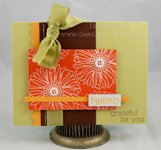
I chose this card because the design was quite bold and the colours weren’t ones I would use that often. I thought that would be a good starting point to add my own touches to the design.
Here’s what I came up with:

I’m actually pretty happy with how this card turned out, even though I still think the colours aren’t really ‘me’! I kept with the colour scheme and with the main points/composition of the design, but I changed it up by using In Bloom instead of Friends ‘Til The End.
I stamped the flowers and leaves from In Bloom on Orange Zest cardstock using Versamark ink, then embossed with white embossing powder. I then blended some Terracotta Tile ink over the design with a tissue to add a bit of depth, as well as inking the edges. I lost the white colour due to the ink staining but in a way I’m pleased as it softened the look a little.

Other little changes I made included stamping the Dark Chocolate layer with Background Basics: Petal Power, again using Versamark. I wanted a hint of pattern that wasn’t too busy so I think it worked quite well. I used my SU!/EK Success punch to add the detail to the Summer Sunrise cardstock, but I tucked mine underneath my ribbon and overlapping the Dark Chocolate cardstock layer.
And did you spot the ribbon?!! I was really inspired by this card that Dawn showcased this month with her Studio Style set:
So I decided to attempt … the double bow!! I used Vintage Cream Luxe Satin ribbon and Spring Moss Topnotch Twill so that I could have a two-tone effect. This was *very* fiddly to do but I think I more or less managed to pull it off, and I even have the faced side of the satin showing on the top as well!!

Finally, my other little design touches were to round the top corner of the card base and the In Bloom panel to soften the overall look, and my sentiments came from Communique Sentiments and Blooming Button Bits, with the ‘Thank You’ sentiment being stamped on Vintage Cream cardstock instead of white.

Maile’s Card
Maile’s card choice came a little easier to me than Dawn’s one. Her use of the In Bloom stamp set really made me take a whole new look at this set and I’ll definitely try to think of more creative and ‘out of the box’ uses for it in future! One card that stood out to me in particular was this beauty:
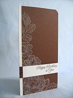
I just love how classy and sophisticated this card is!! The colours used also mean it can be changed to work with other colours and the design would still work perfectly!!
Here’s my take on Maile’s design:

Same but different huh?! I really wanted to try and make the design fresher and more funky, so I took inspiration from another of Maile’s In Bloom cards:
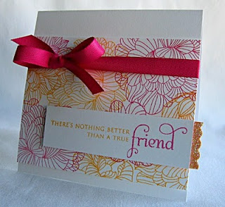
I think combining my favourite things from both cards worked really well!!
I started with a Stamper’s Select White card base and rounded the top corner. I then stamped the In Bloom flowers and leaves using Raspberry Fizz and Summer Sunrise inks, alternating as I progressed with the design. I kept the same layout for the blooms as I thought this was already perfect!!

I then scored two lines 1/8″ apart, 1/4″ from the spine, using my Scor-Pal. I then added a strip of 1/8″ Scor Tape and sprinkled on some more of my custom coloured glitter, this time blending Martha Stewart’s Tourmaline and Kunzite glitters.

Finally I added a strip of Summer Sunrise cardstock, with the sentiment coming from In Bloom and stamped using PTI’s True Black ink. By using the glitter strip and the Summer Sunrise panel I still kept the elements of Maile’s criss-cross design but freshened it up and was able to incorporate the two colours in a fresher way.
So what do you think?! I really enjoyed the whole process of picking out my favourites, dissecting what I loved most about them, and then putting my own creations together combining my favourite elements from them to add my own spin on them!! Maybe there is a way that CASEing and me can coexist peacefully after all, lol!! I’d love to hear what you think of these creations, and also which is your favourite, both from the original design and from my takes on them!! Enjoy the rest of the Hop and thank you so much for stopping by!!
Wow! What a great post…love your take on the cards…Dawn has been a long time favourite and Maile has been so wonderful and creative this past year since I've known her. Loved your commentary on everything 🙂
Just beautiful! I love the color combinations!
Taheera both cards are beautiful (i heart in Bloom). You did a great job on the challenge but still made then uniquely your own !!
Loved your cards! Maile and Dawn really are amazing! :>
Beautiful cards! Nice job using Dawn's and Maile's cards as inspiration — and nice tribute to the two of them, too.
Great cards. I love the double bow on your Dawn card. Your Maile cards are fabulous!
First off, great job on both cards! They were both absolutely beautiful. Of the designers, I liked Dawn's card the best, and for the same reasons as you. Her use of colour is jaw dropping. Of your cards, I liked In Bloom the best. It was just so clean and simple yet the colours were so striking. I think the C.A.S.E. is in your future…