Hey everyone!
Sorry for my absence! Things got crazy busy and, on top of that, my camera broke, so I couldn’t take any pictures of any creations! But I’ve borrowed a friend’s camera so that I can bring you my entry for the latest Embellish Magazine Colour Trends Challenge:

So, a fun colour combo and a masculine theme! I know some of us really dread making the masculine cards but I love them as I get to depart from my usual style for a bit and make something that is a) fun, and b) a lot quicker to make!
So here’s my take:

Pretty funky huh?! I love how easily and quickly this came together!
I started with a Soft Stone card base and stamped Background Basics: Newsprint on it using SU! Going Grey ink. Then I inked up just individual adverts from the same set and stamped them randomly on the background with the same ink.
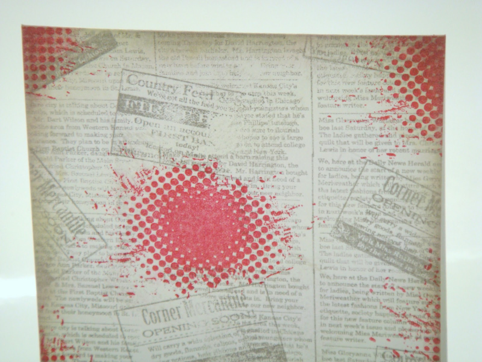
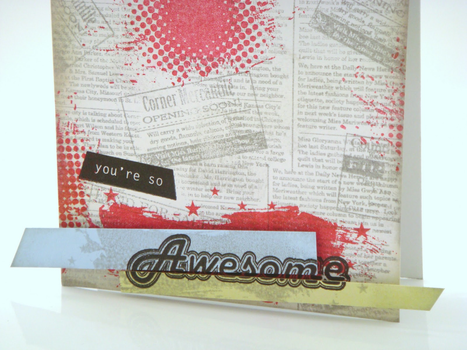
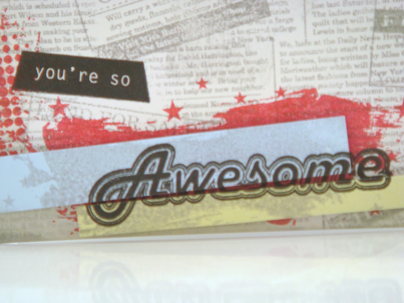
I then stamped one of the images from the WPlus9 So 80s set using Pure Poppy ink. Let me just say that although I am a PTI Girl through and through that I really love this set and a few others from WPlus9! I especially loved the retro funky feel of this set and thought it was about time that it got a showing!
After all that background stamping I edged the card with a little VintageTouch Chamomile ink. However I wanted more of a dirty grey look so I rubbed my cube onto my Smokey Shadow inkpad to pick up the grey and used that. I really love how it turned out – and my cube is still usable! Warning though: don’t try this at home unless you are happy that your inkpad won’t be the ‘true’ colour it was. Mine was drying out and I didn’t want to re-ink it (I have spares) so I decided to sacrifice it for art! ;o)
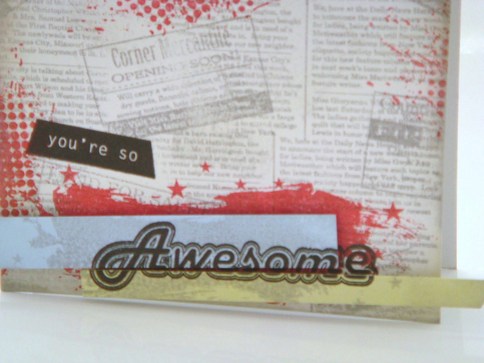
After this I trimmed some strips of Spring Rain and Spring Moss cardstock, angling one end of each. I played with the design a little before settling on an idea. I stamped another background image from So 80s then stamped the ‘Awesome’ stamp over it using Versafine. I then overlaid the strips and overstamped the background image using Going Grey ink then overtsamped the sentiment on them so that the strips were at an angle (both with the base and with each other) but aligned with the word. I stamped the ‘you’re so’ sentiment then adhered the strips off the base with Pinflair Glue Gel.
So there you have it! Not much PTI, I know! Shocker!! But I’d love to know what you think of this card. Thanks for stopping by!!
Very funky and perfectly masculine. Thank you so much for playing along in the Embellish Challenge.
Oooh, this rocks! Love it!
All your layers are so cool! I really love your card! Thanks so much for playing along with Embellish!
This is just too cool Taheerah! I looove how you used the colors!
This is an awesome card for this challenge, Taheerah!!! It's just perfect! Love the background with the advertisements over top in a random way…..Perfect!
Great card. I wouldn't have even recognized the newsprint background. very clever use of it. I like the way your sentiment is split between the two strips. very eye catching.
TFS
Ang
Really awesome, Taheerah! Love love the grunge background. And the graphic pieces with the sentiments, makes the card perfect for Teens. Love it.
The sentiment says it all. The card is awesome!